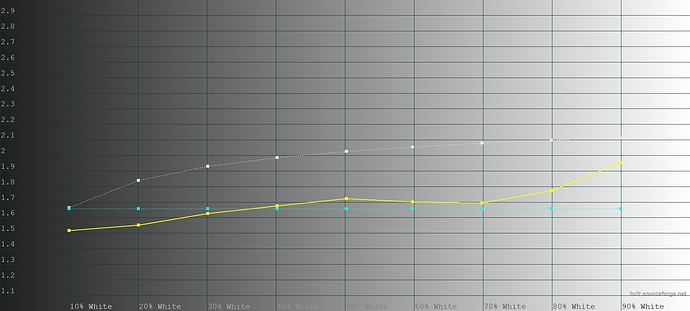
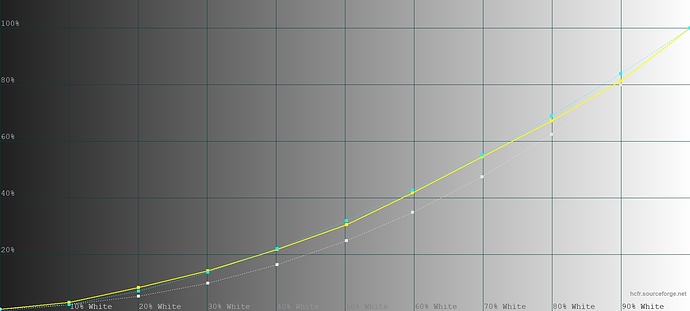
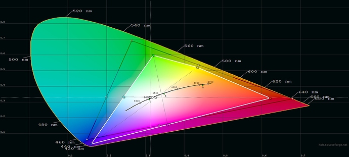
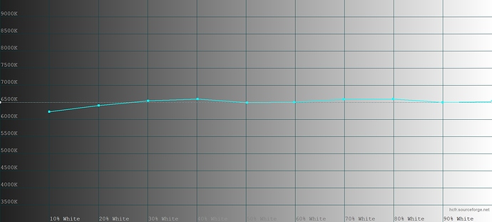
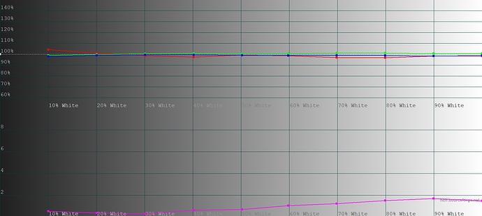
I started in energy saver mode, but from what I understand from the above explanations, the energy modes are just presets of different power levels for the LED (which is also visible when you check the color app in the different modes), so if you manually change the LED power levels, you override the energy preset created by the current mode, effectively making your own preset mode (until you restart, then the mode will fall back to its standard values).
As for the reference images, I’d suggest using something from your usual use cases. The projector is not nearly as easy to calibrate as for instance a TV because there are many different use cases and the apps or external inputs also partly influence how something looks. Personally, I want to mainly use it for video playback (my main use case is to use it during comic festivals at my booth to get a video camera live picture from what the invited artists are currently drawing projected onto the wall behind them so that the wait for the people in line is less boring), so my calibration process was switching back and forth between the app and videos with natural colors. These are a bit tricky to find nowadays since so many tv shows and films are heavily color graded, but I found that “The Office” works very well for that purpose. It’s got a very natural look and if you calibrate the projector so that the colors look like real life there, that’s a good preset for all other movies and shows as well.
For saturation and contrast, on the other hand, I’d suggest using for instance a cartoon show because all overexposure and oversaturation (especially for individual colors) will be much more obvious there than in regular videos.
Here are some short test videos I took yesterday of the calibration result. It’s not exactly what it looks like in reality (just filmed quickly on an iPhone in the dark, so contrast is a bit too steep, and skin tones look a bit too reddish, which they don’t in the actual projected image), but it shows how the shows can be used to get a more or less neutral image:
Moonlight:
The Office:
The Looney Tunes Show:
In the Looney Tunes Show clip, it’s well visible that the greens are still VERY in your face oversaturated compared to the other colors despite turning green down to a minimum. This is most likely something that would need to be changed by the developers in the PPM’s gamma curve. But the way I’ve set it up now it’s at least not affecting the neutral look of the image anymore and only really visible in things that are either plain green or light blueish/turquoise.
Mind you, while this looks more or less neutral to me on my wall and close enough to the professionally used colors on my notebook (since I work in comic book publishing, I need to be able to see even tiny nuances of different color tones), this is obviously nowhere close to perfectly calibrated. It’s much better (at least for me) than the out of the box colors, but to get a perfect image, this would need several more hours of switching between the app and the video, which I didn’t feel like anymore after getting a well usable image, and would also need for the developers to get rid of the overprioritized greens.


