It should also be noted that the default out of the box sharpness of 50 % is too high. It’s not too obvious for real-life content (except that details like stripes on suits etc. will look unnaturally sharp), but if you play a cartoon, you’ll see that the outlines look juddery and will have white lines around them as if you sharpened a jpg too much. I especially noticed this on She-Ra on Netflix, which has very fine and thin outlines. A more or less neutral look is reached at about 25 % sharpness.
1 Like
I set mine to 7% initially but now have it set at 0%
Yes, I think it’s best to leave the sharpness between 0 % and 10 % and just regulate everything with the hardware focus. (For 0 %, I found that both the UI as well as the video contents were already a bit too blurry, but I might have needed to readjust the focus for a more exact result.)
1 Like
We have an internal test protocol and several standards. Not every product can match the standards (else we can all pack up and go home).
However I can share with you the basic parameters to aim for:
| Parameter | Target |
|---|---|
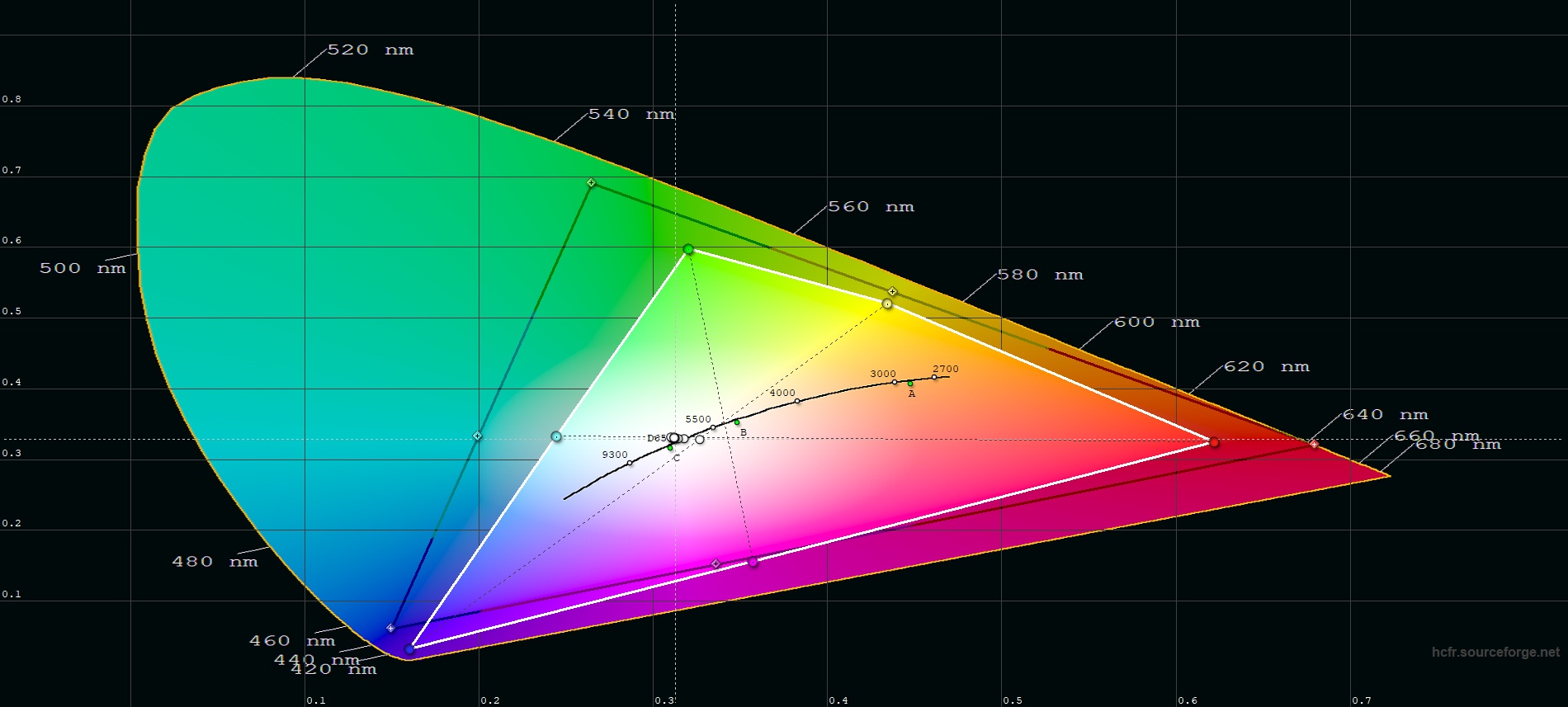
| White point | (x=0.3127, y=0.3290) |
| Red chromaticity | (x=0.640, y=0.330) |
| Green chromaticity | (x=0.300, y=0.600) |
| Blue chromaticity | (x=0.150, y=0.060) |
| Gamma (EOTF) | BT.1886 / 2.4 / 2.2 |
The only realistic adjustment you can make is the white point, which also has the biggest effect on picture.
This is a huge topic which I will expand on later.
Also note, if you want a calibrated image, you cannot use your eyes in place of a sensor.
1 Like
Would be nice to have some picture example on how good/bad image you should get for comparsion! Including optimal settings for HDMI connected devices!
I have a ok image with the built in apps, but when using HDMI the color setting seems to be different! Don’t know if it’s after the latest update?
My PC on HDMI (GTX980) Windows 10, seems to not produce or maybe ”the projector” do not deliver a sharp image it’s blurry, colors are washed out, thin lines are very hard to read, text is jagged! This is not the case if you use a TV or Monitor!
Looks like it’s not native 1920x1080!
(Still PC says it’s 1920x1080 60hz, 8bit color depth…)
Have tried alot adjustment of brightness/sharpness and other, but still blurry and bad sharpness…
Will tweek and try a different HDMI cable and connect another HDMI device (Apple TV 4K to see if it gets sharper…)
Did you validate HDMI port usage from a Windows 10 PC / Laptop? What image quality should you expect in the different modes?
Would like to see reference images on like a 77” screen size, to understand if i have a bad Projector or if it’s settings that’s wrong!
I’ll investigate this some more this weekend, but if you have any tips / reference images please let me know!
/J
I’ll put my observations here as they fit. If you’d rather have picture quality discussion outside of the KB, feel free to move it.
Ran a quick round of measurements using both internal and external sources to get a better idea of why the picture looks the way it does.
First off, the good:
-
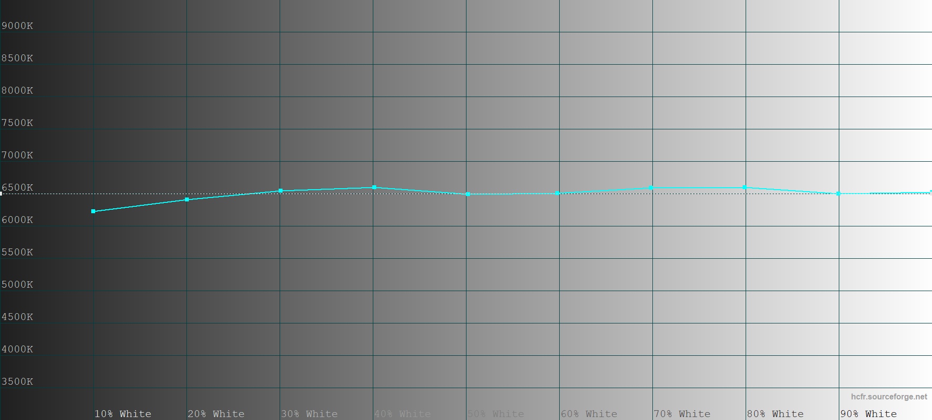
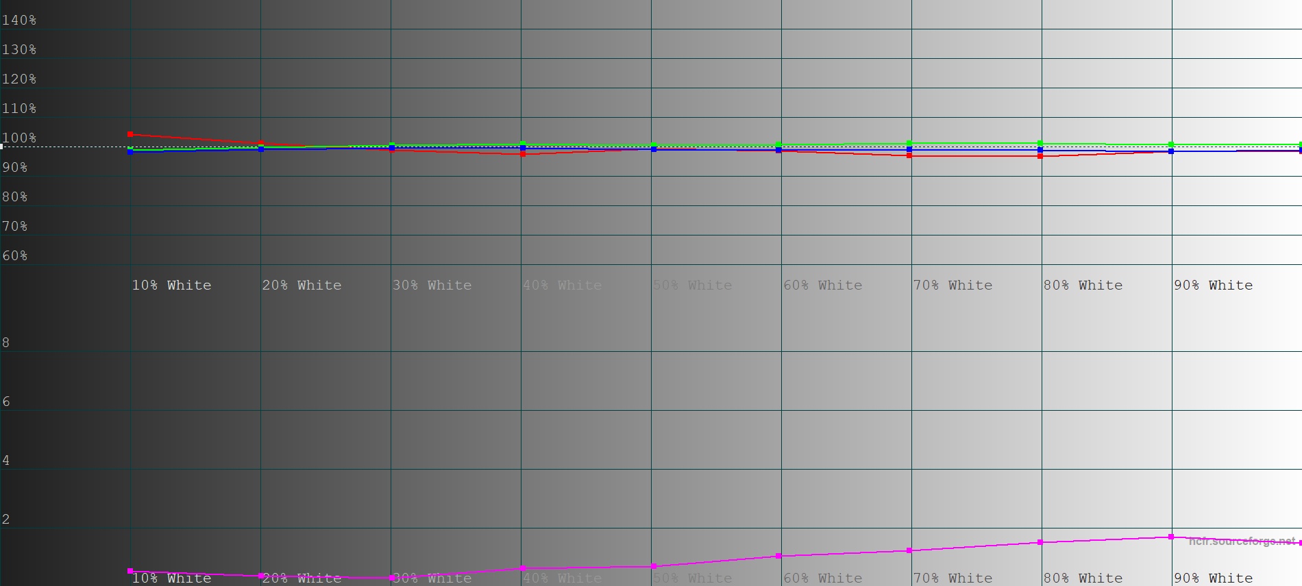
a big compliment to Prashant for fighting for an off-the-production-line calibration for us. It shows! Only being a hobbyist I don’t profile projectors every day, but I’ve seen a bunch in my time, and rarely have I measured one with RGB levels this close to target out of the box. Obviously they’re not all created equal, and that’s even more impressive. Mine is just a tad weak in the red across the range, bringing the color temperature up to just over 6600k. dE is below 2 across the spectrum. Good work, man! (internal and external)
-
Also, the corrections posted here leave brightness and contrast at just the right level for internal playback. (internal)
-
External is almost the same, with only minor clipping of the highlights. (external)
The not-so-good:
-
The primaries and secondaries (the colors) aren’t perfect, blue and green (and yellow as a consequence) in particular. Red is closer to target. I’ll look at the measurements some more tomorrow. Either way, I’m not expecting perfection here for a product of this price range, and as mentioned the levels are very good. (internal and external)
-
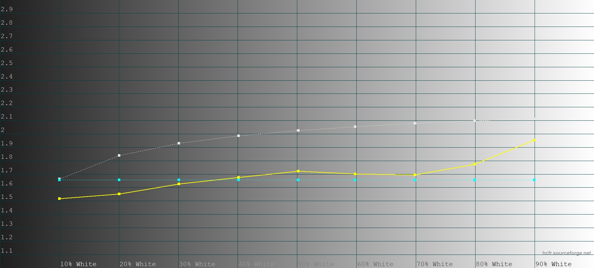
The gamma. This is the big one that ruins the subjective impression. Everyone who sees PPX is going to go “the picture looks flat”. It could look so much better! I ran the measurements a few times to make sure, but it really still is between a 1.6 and 1.7 average. No wonder it looks so washed out. (internal)
External gamma measured even lower, but it was only one round of measurements. Will do again to confirm. (external) -
Sharpness. Only an external source problem now. It’s bad. Thick halos everywhere, creating a harsh look, jagged edges and eating up fine detail. Needs an adjustable setting, a selection of “looks” or to be toned down to 0 globally. Internal is beautiful in comparison. (external)
I’m aware that a “looks” feature has been in beta for a while. I’d be glad to test it out when you get around to that application form I filled in. No sweat, though, it’s not going anywhere.
Cheers for all the hard work Prashant. Your passion adds immense value to this product.
9 Likes
How are you measuring this, what equipment / software are you using? 
I’m using an i1 Display Pro colorimeter for measurements, profiled by an i1Pro 2 spectrophotometer for accuracy. The colorimeter is inexpensive, fast and consistent, but it needs a bespoke correction matrix from the absolute light measurements of a spectrophotometer to be completely accurate. You can use it without and it won’t be far off, but you’re asking and I’m a nerd.
Software you can use the supplied ones, but I never have. There’s a really good functional, if ugly, free open source project called HCFR. The commercial ones are typically geared towards calibration professionals, and the cost reflects that: ChromaPure, CalMan, ColourSpace. HCFR does the job, though.
3 Likes
Hi @Liersi thanks for your feedback. Could you upload your measurement results or PM them to me?
I am concerned about the low gamma you measured. It is supposed to track BT.1886 which is approximately 2.3. But it is easy to get a too-low or incorrect measurement, sometimes because of not setting the target gamma that your measurement program is expecting, but most often because of reflection from white walls back onto the screen with projection, or some other type of external effect. You can increase the accuracy by projecting from a close distance, e.g. keep the projector at 2-3 feet and the screen size about as large as a TV or smaller.
That said, gamma/EOTF curve standards only apply to controlled dark theatre environment. It’s usually better to err on the lower side, because most people will end up using it in situations with ambient light, where a pure 2.2 or BT1886 gamma will result in loss of perceived brightness. Frequently as low as 2.0 or 1.8 or a non-power curve looks better in such conditions.
The primaries are approximately DCI-P3 but it’s very difficult to get it correctly aligned at this price and size class, you’d need to order 100k or more light engines to be able to select LEDs with the right chromaticity and tolerance. Most of the engine tuning is done after-the-fact, since you can’t always pick which light engine is used in the product due to various factors.
The sharpness control should also affect HDMI, it doesn’t for you?
PS: you’re added to beta list now.
2 Likes
Sure, which measurements do you need? Grayscale, Primaries? test.PrimariesSheet.csv (585 Bytes) test.GrayScaleSheet.csv (1.3 KB)
I hope this works.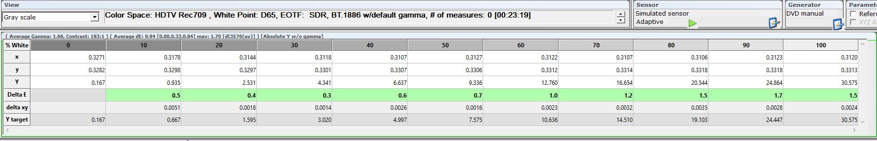
You reminded me to check the references, thank you. EOTF is using BT.1886 reference. Colour space was REC709. I switched it over to DCI-P3.
The looks are about color I understand. I ran some quick measurements on a bunch of them, and gamma/EOTF always behaved the same. Are any supposed to be different here or is that intentional?
The conditions I measure in aren’t bat cave perfect, but pretty good. All directly reflecting walls are draped in black. The screen is effectively recessed into a 2-3m black hole. Beyond that reflections can get back in, but it’s minor. I have to turn on the light to find the PPX remote if I misplace it, for instance. Little black bugger 
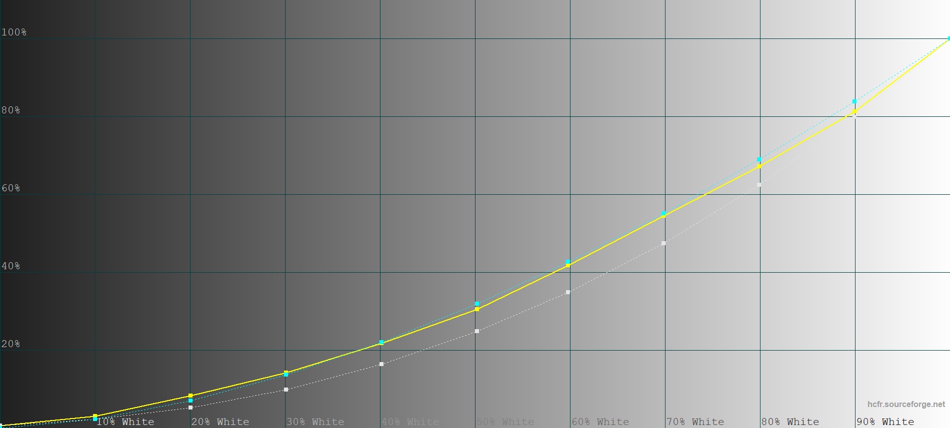
I’ll attach my graphs for the default look 3 (thank you for the beta access) with minor adjustments for the red weakness.
You asked about sharpness. On my PPX, this doesn’t carry over to HDMI from the look of it. But judge for yourself (beware, cellphone images):
Internal:
External:
6 Likes
Hi @Liersi What’s your video chip version (Settings > About)? And are you using HDMI for your measurement pattern generator, or is Android somehow involved? What EOTF tracking do you get when you “RESET” the hidden sliders from this thread i.e. without the ‘corrections’ applied?
Also, HCFR uses single shot measurements and doesn’t wait long enough to integrate the measurement in my opinion. Are you able to try with LightSpace or CalMAN too? Or tweak HCFR to dwell longer or take multiple shots per colour?
1 Like
Thanks for the response, @Philips_Support_P. I’ll get you the info you asked for tonight, as well as do further testing per your request if time permits (before/after RESET, internal Android/external HDMI). I’ve been using both Android and HDMI sources so far, and they weren’t much different, if at all. I’m in the process of setting up an old RPi as a PGenerator, which will obviously be HDMI.
I’ll also double check what settings I’m using in HCFR for the measurement to make sure. What measurement time do you recommend to get an accurate reading? Also requested a free Lightspace download from their site, it’s about time I checked it out. CalMan is too expensive for me in its current iteration. Wish they still offered enthusiast-but-not-pro licenses.
Will get back to you asap.
2 Likes
How it’s work ? Can I somewhere set the color the value for green etc ?
Preset 14
Red 780
Green 110
Blue 330
If it’s stupid question sorry…
1 Like
You can’t at the moment, unless you sign up as a beta tester. An app to adjust colour is planned to go public at some point, though.
2 Likes
Any further developments on improving the picture looking flat (washed out) that Liersi mentioned?
I also have an LG PH550 that my kids use and the colors and images on the LG really pops out but the PPM does look washed out or flat in comparison.
If I didn’t have the LG to compare to start with, I probably wouldn’t be thinking about this but since I do, I can’t help thinking that the PPM picture looks flat. 
3 Likes
Hey, I’m glad there’s finally someone else on this soapbox. As you can see in this thread, I’ve been saying this and asking for changes for four months. I just said to my girlfriend a minute ago that if more PPX users had another projector to compare it to, they wouldn’t accept it as it is right now. It looks that flat. This isn’t subjective, it’s measurable, the gamma is way too low.
It’s a shame everything went dead here the way it did. Nothing ever came off any of this. Patience was somewhere a few months ago, now it’s obvious no one’s working on anything related.
7 Likes
This proves comparison breaks happiness 
I don’t have anything to compare to but I agree that if people sees the image quality is not good enough then something has to be done if possible.
1 Like
But let’s not get too hasty here, as marketed the PPM IS a HDR10 projector after all. All those beautiful colors and the wide dynamic range are somewhere in there! If we just close our eyes and open our minds.
3 Likes
I actually didn’t need a comparison, nor was I ever happy with the way the image looked. I saw it with the naked eye, right away. The measurements just confirmed it. The PPX isn’t worse than another projector, it is measurably way off any of the reference standards for video gamma. The comparison only makes it more obvious.
I was happy to wait for this to be addressed. Now I’m worried that it won’t be, and that would be crushing. People will put this down to bad contrast, which it isn’t. This is entirely fixable, as is the unnecessary sharpening on external input.
This would be a great performer if these were fixed. You can work around a cumbersome UX, but not around flaws like this.
7 Likes